SÍSTOLE
Inspired by the beauty and character of Charles E. Heyer’s Princess Script, Sístole also challenges the convention that script fonts must be fluid and delicate to convey elegance. Its firm strokes and abrupt breaks evoke the emotions that dwell in a heart that is beating intensely. Each set contributes uniquely to its bold personality, while its lowercase letters maintain a contained width and uniform rhythm, the uppercase letters expand, achieving more expressiveness. Despite its strong character, the elegance given by its script essence remains intact, establishing Sístole as a typeface that is both sophisticated and avant-garde.


I personify the elegance of humanist typography in a body sculpted by the principles of rationalism. Centuries of tradition nourish my DNA and manifest in my details. My classical proportions, inclined axis, and wide apertures pay homage to an era of artistic splendour.
While some of my contours flow with clean lines and curves that evoke geometric precision, others have determined angular cuts reflecting my desire to speak with frankness and conviction. With this interplay, I endow texts with a solid and structured character projecting the sense of order and logic reminiscent of an architectural plan.
I will uphold your words with grace and clarity, drawing on the richness of my historical heritage while embracing the spirit of contemporary design. Thus, my name is the synthesis of my story: I have been reborn from the seed of Renaissance finesse to bloom perennially.
I am Renatus.
Renatus


Studio Electric
Studio Electric, producers of motion design and animation, sought an identity refresh. They envisioned a custom lettering piece for their logo that would encapsulate the dynamic essence of their work. The design process involved experimenting with the visual language of electricity, using shapes like the sharp edges of volts and the curves of neon tubes to incorporate them into their name. The result is a logo in a vibrant script style that uses the connection between letters to evoke the vibrant spirit of electricity.


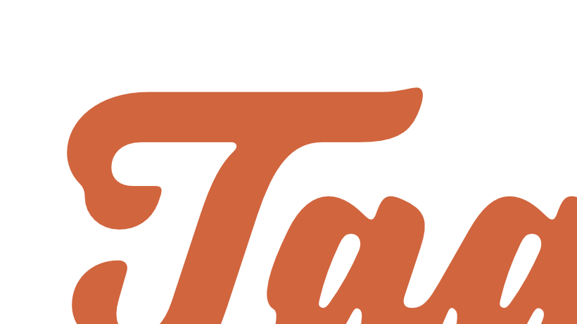
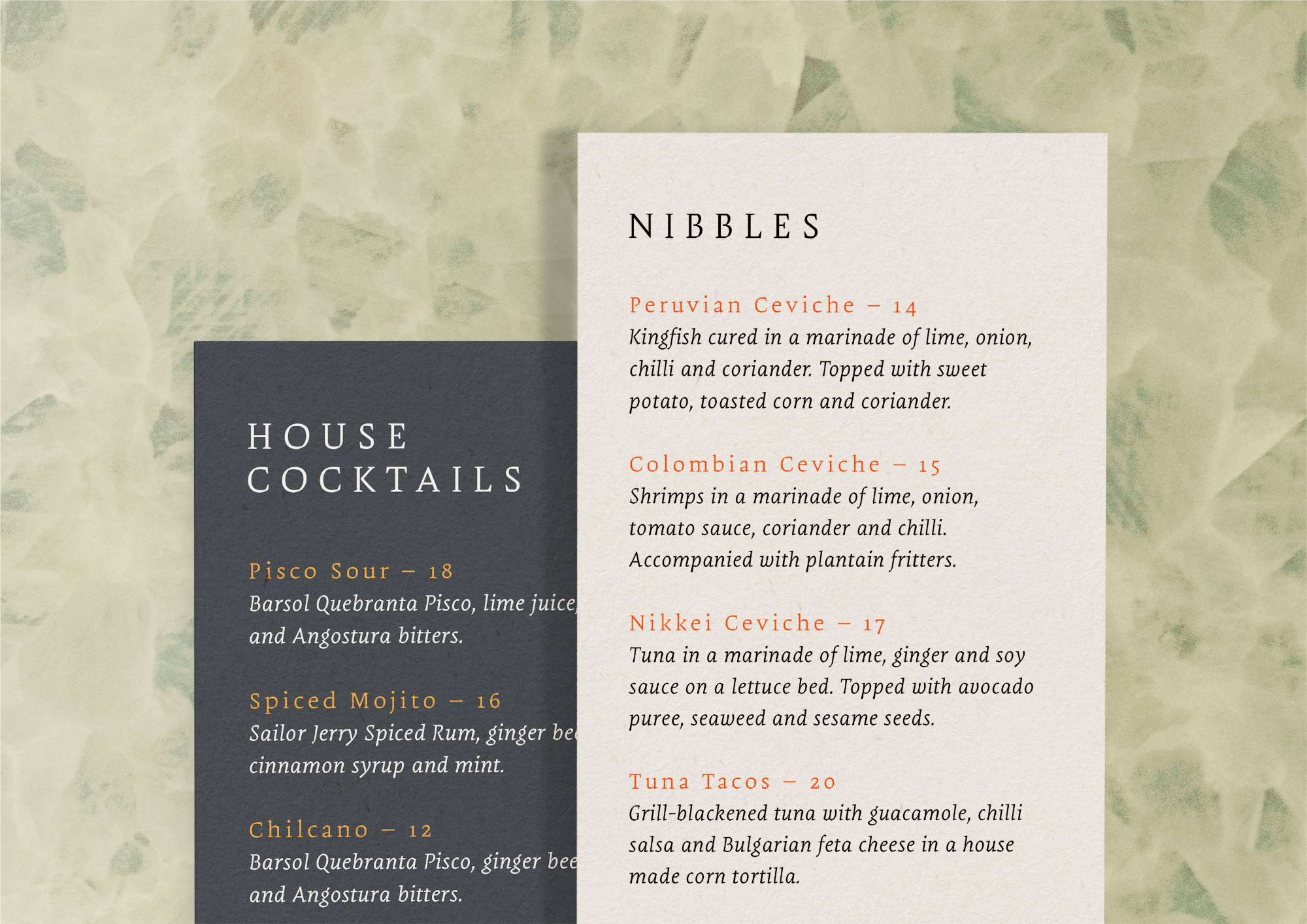
TAQUERÍA SÁNCHEZ
Taquería Sánchez is a celebration of the humble and traditional spirit of Mexican food, all within a joyful and fresh atmosphere. This lively essence is projected through a vibrant identity drawing inspiration from Latin-American visual pop culture, utilising contrasting colour and type palettes.
The identity’s anchor is a bespoke, hand-lettered logotype inspired by the aesthetic of traditional street signage. Its fluid, high-weight strokes are have an organic touch to project human authenticity, craft and approachability.
To continue the brand narrative, a typographic palette was created to use in a range of collateral materials, including menus, coasters and stationery, ensuring a cohesive experience across every touchpoint.
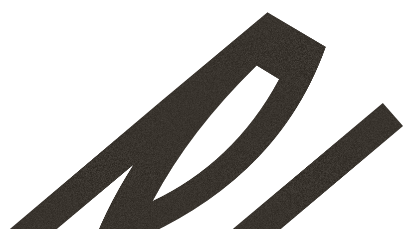
Papermov is a typeface that leverages geometric forms and angular cuts for both aesthetic and functional purposes, inspired by Dwiggins’ M-formula. Its sharp contours enhance legibility in challenging conditions, providing a distinctive crisp texture to paragraphs. This makes Papermov ideal for small print sizes and scenarios where conditions are not optimal.
Papermov


Trochera draws inspiration from the Tuscan style types commonly seen on public transport signs in Latin America, presumably inherited from ‘chivas,’ the typical colorful buses used in rural and mountainous regions of Colombia. It embodies an expressive and festive personality, defined by its curvy contours, lateral spurs, and leaf endings that mimic the dynamic behavior of woodland plants. All these details come together to give Trochera an exuberant character, making it ideal for type compositions that don’t want to go unnoticed.
Trochera

Brutman reimagines the incise style for the 21st century. Its foundation is rooted in the humanistic style, adopting the structure of Roman capitals for the upright version and borrowing elements of the chancery style for the italics. Its contours, however, are shaped by the brutalist ethos, evident in its asymmetrical flared terminations, sharp shoulders, and diagonal cuts. The result is a typeface that marries a sleek, modern character with a touch of elegance drawn from its historical roots.
Brutman
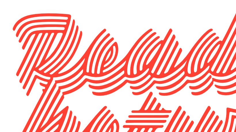
This piece was created for Letter-form, an exhibition showcasing the collective work of 35 lettering artists from Melbourne. The goal was to challenge the traditional notions of legibility, exploring the idea that it’s not just defined by shapes and counter shapes. The inspiration came from hand-painted signs, particularly observing the effect of strokes so thick that they almost suffocate the counter shapes, yet maintain legibility through the striations that reveal the direction of the brushstrokes.
LETTER-FORM


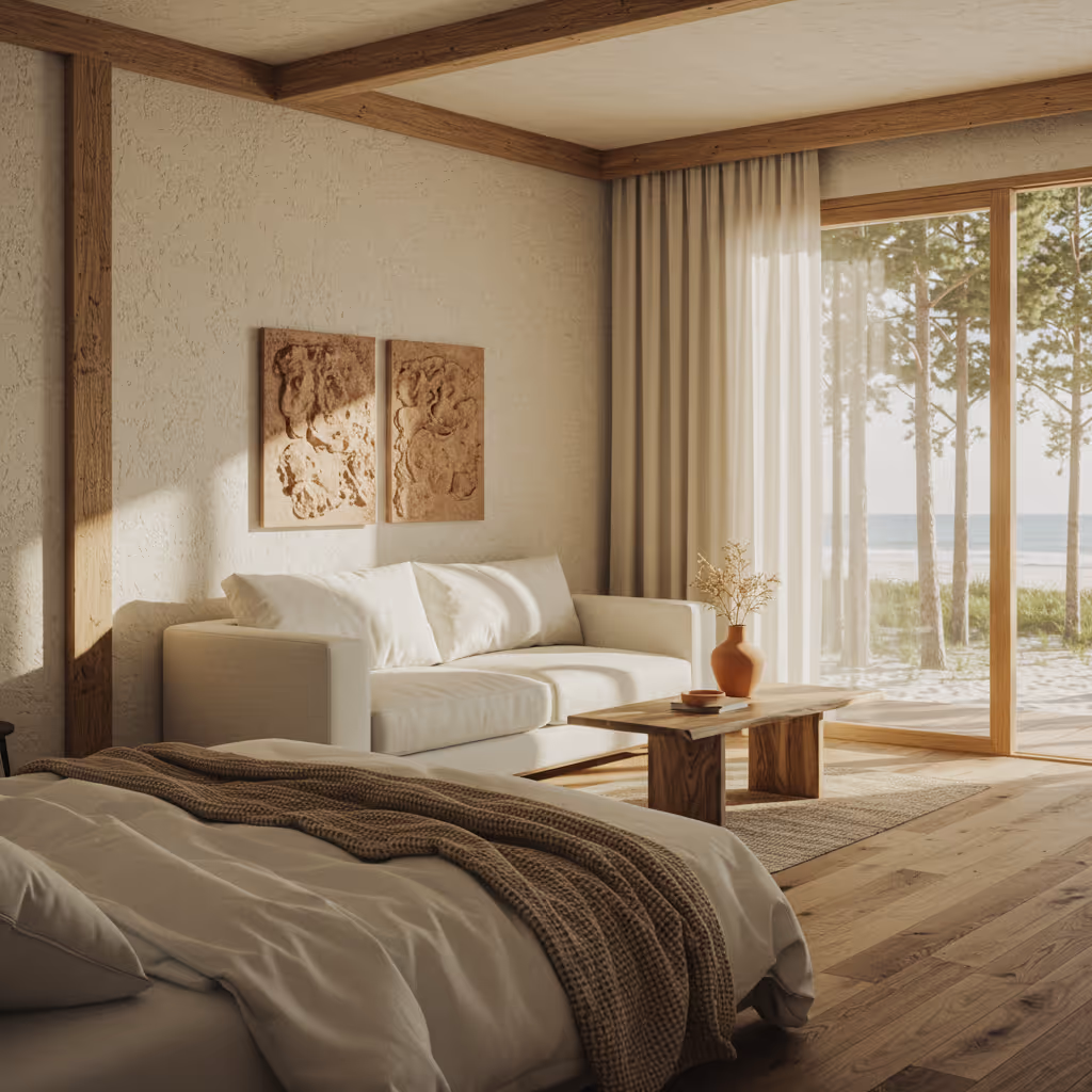


Ahãma is a luxury resort located on Turkey’s Turquoise Coast. Blending the elegance of its architecture with the beauty of its landscapes, it provides a tranquil sanctuary for guests seeking a rejuvenating wellness experience. The brand aims to convey that sense of sophistication that is both relaxed and deeply connected to nature. This custom word mark features imposing capital letters that combine sharp edges for an elegant touch with rounded counter forms to create an organic and serene feel.
Ahãma

Indie is an app created to connect independent film producers with emerging talent. They required a logo that symbolized storytelling through handwriting while transmitting a sense of excitement. The lettering uses a handwritten style and incorporates tension to evoke the feeling of someone passionately penning a narrative or an important idea. To reinforce this message, an asterisk and an underline complement the word as these are elements used when something needs to be highlighted.
INDIE

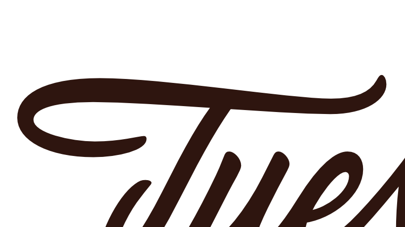
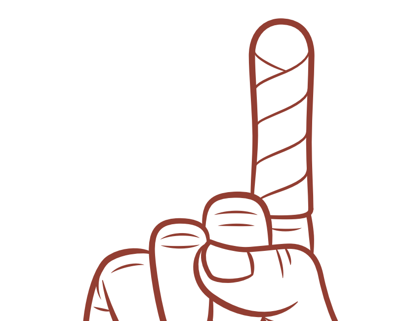
NO PAIN, NO GAIN
No pain, no gain portrays the ironic relationship between victory and sacrifice coupling lettering and illustration. The lettering part is based on the Spencerian structure and confronts rounder counters with sharp contours to add texture.