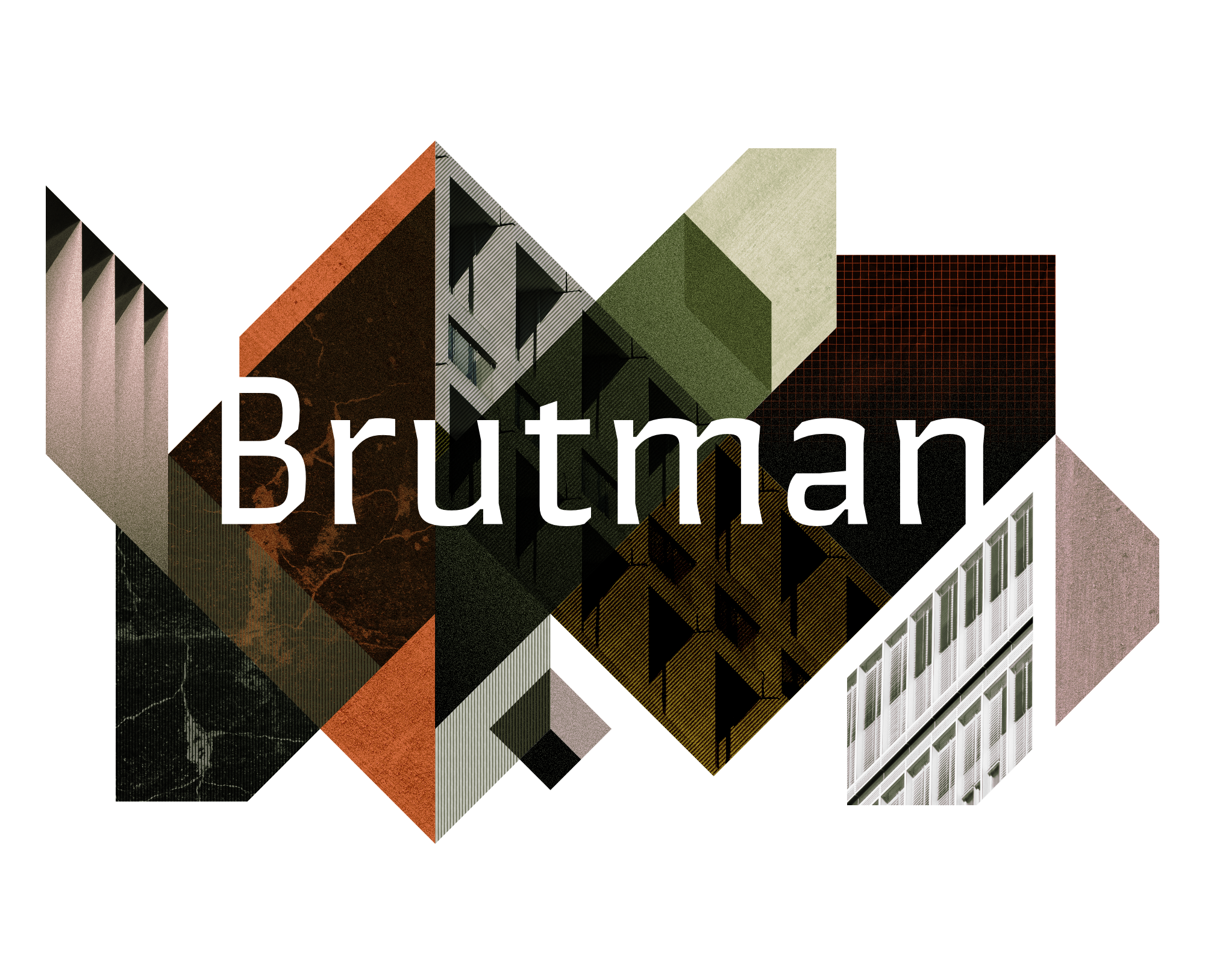
Renatus
This typeface aims to give body texts a modern, elegant and structured look. For this purpose, elements borrowed from the Renaissance style are reinterpreted through geometric and sharp shapes pursuing a sleek and minimalist feel. hybrid that puts together curved and angled contours; serifs that integrate seamlessly on one side with serifs that emerge abruptly and ink congestion that is represented both geometrically and organically.

Ahãma
Ahãma is a luxury resort located on Turkey’s Turquoise Coast. Blending the elegance of its architecture with the beauty of its landscapes, it provides a tranquil sanctuary for guests seeking a rejuvenating wellness experience. The brand aims to convey that sense of sophistication that is both relaxed and deeply connected to nature. This custom word mark features imposing capital letters that combine sharp edges for an elegant touch with rounded counter forms, creating an organic and serene feel.


Studio Electric
Studio Electric, producers of motion design and animation, sought a dynamic identity refresh that captured the potent essence of their work. The process involved exploring various approaches to represent the concept of electricity with a lettering piece. The result is an electrifying logo, presenting a vibrant script style that mirrors the studio’s spirit.